Interior designer Peta Smith primarily works from her five hectare property in Bellbrae, on the Great Ocean Road. But after picking up more clients in Melbourne, Peta found herself commuting to the city a couple of days a week.
With her husband Dale also commuting to Melbourne, and their daughter Poppy starting university in the CBD, the couple realised their most practical next move — buying a city bolthole of their own.
But they didn’t want just any apartment. As Peta has an eye for design and an appreciation for historic architecture, the pair had been looking around for the perfect heritage building to reside in. When they came across a two-bedroom pad in a coveted site on the corner of Exhibition and Flinders Streets, they knew they had found their match.
Originally built in 1924 as the home for the Victorian Cricket Association, the iconic building was later converted into a block of just 24 apartments — including Peta’s!
‘When we first saw it, we fell in love,’ she says. ‘It had a gorgeous tree right out the window and views of the MCG.’
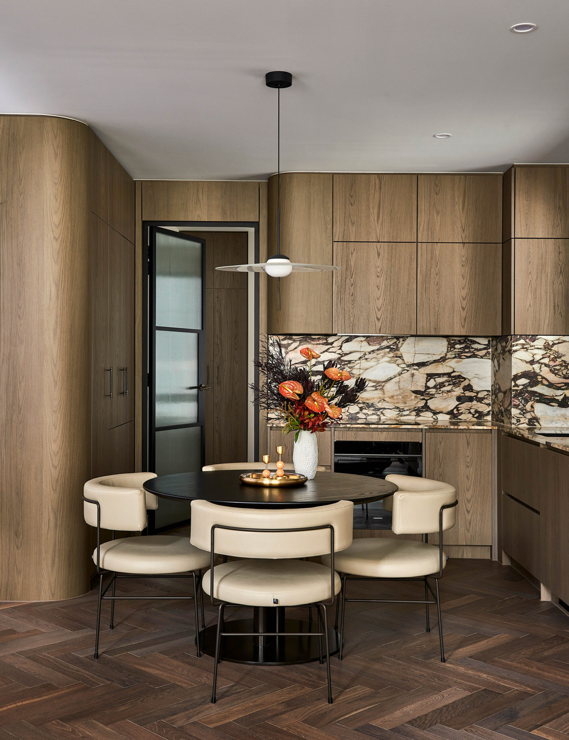
The apartment had undergone its last renovation in the 1990s, affording Peta and Dale the opportunity to completely upgrade the space and make it their own. Taking inspiration from the original 1920s design, as well as dark and moody jazz bars in the city, Peta focused on respecting the age of the building, while injecting a slightly more modern, sophisticated feel.
She brought the original window frames back to black, and changed both the external and internal doors to steel with reeded glass. The original kitchen was previously cramped and outdated, so Peta reconfigured the floor plan to open up the space. Gorgeous calcutta stone benchtops, dark, curved timber cabinetry and herringbone floors all add to the luxe, moody feel.
‘We wanted this apartment to feel like a cityscape where all the details are thought of — beautiful bed linen, towels, robes, a record player and a well-stocked bar,’ she says. ‘These are the things that bring us the greatest pleasure.
‘We wanted the space to have a jazz bar feel, which included natural stone, dark colours and a record player. This also started our interest in collecting vinyl.’
The lavish yet cosy vibe continues in the main bathroom and guest powder room, both adorned with rich chocolate mosaic wall tiling that runs into the terrazzo stone skirting and flooring. Choosing timeless, natural materials was a careful consideration to ensure the longevity of the design, particularly given the challenge of renovating a city apartment. But all in all, Peta says it was a dream to work on the project from start to finish.
‘This was a very special project to be working on, being our own,’ she adds. ‘Additionally, it has sparked my passion for specialising in heritage renovations in the city, blending historical charm with modern functionality.’

