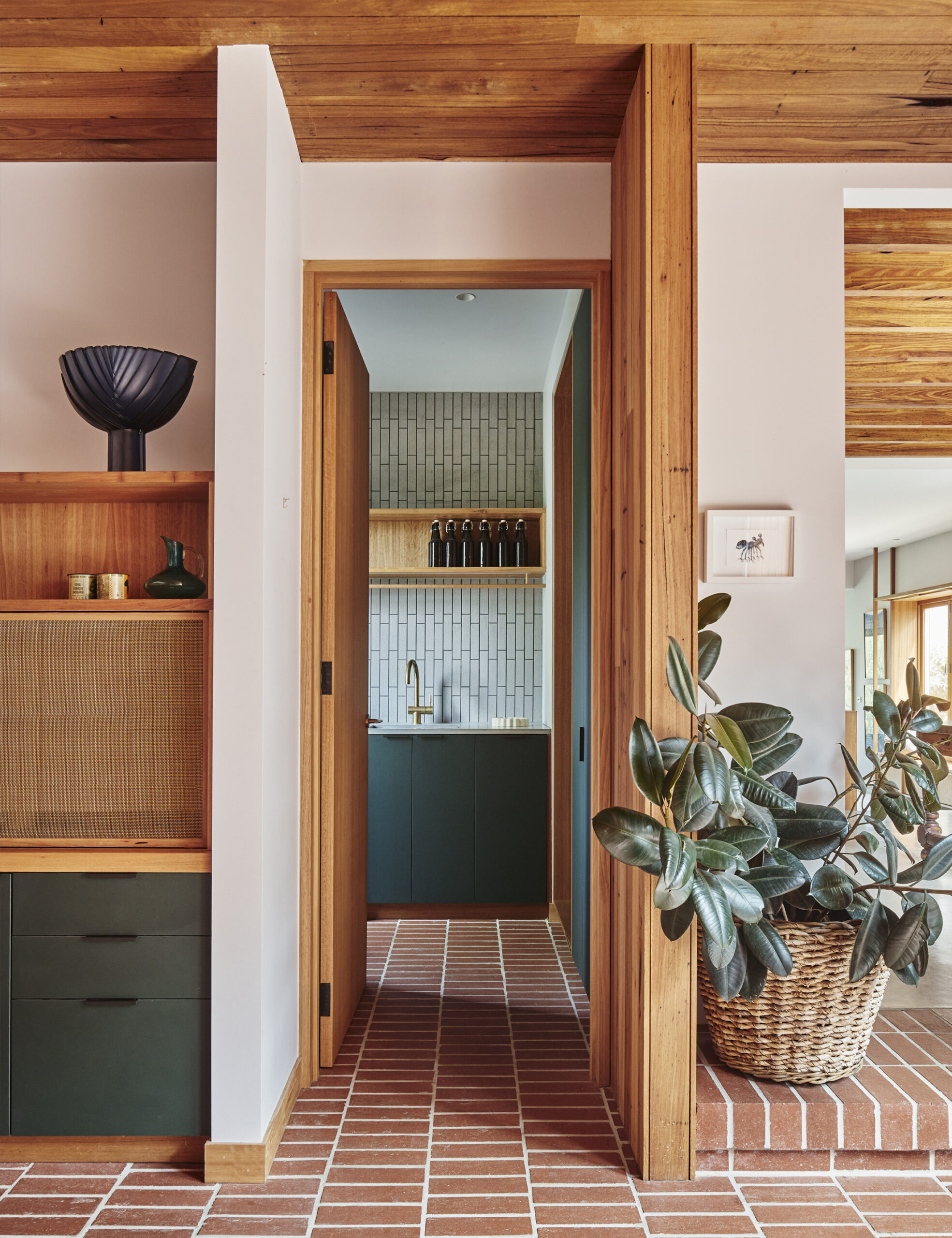
A kitchen is often the heart of a home’s design language, where the materials, colours and textures are most closely interacted with.
The way a kitchen is used is a really personal thing, and requires a very considered combination of function and aesthetics. Below I take you through some of our key considerations when thinking about designing these core parts of a home.
FUNCTIONALITY, DURABILITY AND COMFORT
Functionality, durability and comfort should always be the core objective when designing homes. We always say pleasing aesthetics are a happy side effect of getting the former right. This is especially true in key utility zones such as kitchens and laundries. For us, the most durable product or material is one that ages well and can be repaired. The most functional designs make a resourceful way of life ergonomic and intuitive.
MEET YOUR MAKER
We prefer Australian makers and manufacturers whenever possible. Despite so much manufacturing going offshore, we still have exceptional local tapware, lighting and furniture industries. This is especially true for small-scale makers who may not have third-party certifications but who are stewarding important artisan skills that are being lost to mass production. One of the significant benefits is the ability to engage with the makers and manufacturers not only to explore customised colours and materials but also to have an ongoing dialogue about sustainability initiatives.
LEAVE SPACE FOR INSTINCT
We are all over-stimulated with visual imagery in our digital worlds. Our homes, to be resourceful, need to be enduring. Objects, colours, and materials have an emotional and relational context that you can access through more visceral engagement, like touch and smell. When you are making a lot of decisions, it can be good to actually look at less in order to cultivate intuitive responses. A litmus test we use is to ask ourselves not if we are going to like something in 10 years time (we don’t have a crystal ball!) but if we would have liked it 10 years ago.
THE SUM OF ALL THE PARTS
When picking materials and colours, try not to focus on each element individually. By looking at the scheme as a whole, you can elevate your favourite colour and materials by combining them with others that complement, contrast, or even clash. Pulling all your samples together is essential so you can tune into the way they make you feel when combined, as a design is less about a series of distinct choices and more about the relationships that emerge between all of the parts.
DON’T BE TOO PRECIOUS
Images of aspirational spaces surround us, but ultimately, a home is a vessel for people’s lives to occur within and not a photography location. Feel free to hang onto old things you love, pick up stuff second-hand, sell things you no longer use, mix it all up, be adventurous with colour, and to let your home develop over time. Even when doing an extensive renovation we look to carry some narrative histories of the building, site, and the inhabitants into the newer spaces through motif, colour, form and object. Authenticity is always more beautiful and enduring.
Additional moodboard credits: (From left) Telephone Wire Platter in aubergine from Pan After. Sommerso Glass Block Vase by Vicke Lindstrand for Kosta, Sweden from Gallery Midlandia. Large goblets by Maison Balzac in amber. Hasami Plates from Mr Kitly. Ceramic Vessel by Emily Ellis from Pepite. ‘Tree Composition’ by Torsten Anderström from Gallery Midlandia. ‘Forest Creek’ IX by Laura Veleff from Pepite. Carum jug by Mari Simmulson from Gallery Midlandia.
Want to see more? Visit The Design Directory to discover our top picks in flooring, furniture, lighting, tiles, tapware and more!

