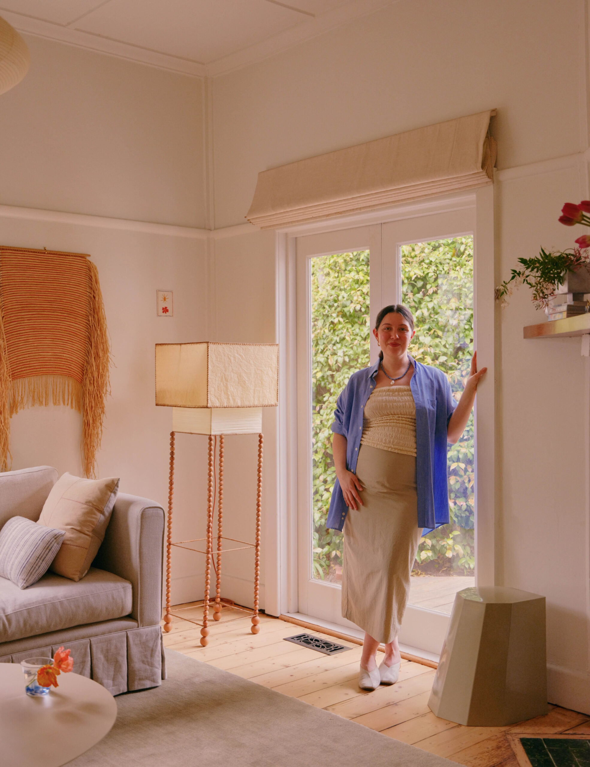
Writer, editor and creative consultant Sally Tabart says the re-decoration of her Thornbury double-fronted bungalow couldn’t have come at a better time.
‘I knew I was ready to move into the next phase of life, and wanted my home to reflect this,’ Sally adds. ‘It was a bit of a “fake it till you make it” situation — I thought maybe if I could make my house feel more grown up, then my life would follow suit!’
Turns out that worked, because now she and her husband are expecting their first baby in January!
The project was purely cosmetic, focusing on new furniture and simple updates to the kitchen, living, and dining room. Sally worked with Leah Holt of LH Design Hub to bring a more ‘classic’ aesthetic to the interiors, including updating her collection of furniture with reworked vintage pieces and custom designs.
‘We spent months and months going back and forth on marketplace finds and things that inspired us, and she also designed my sofa,’ she says.
It’s taken 18 months, and while they haven’t made a single structural change, Sally says it looks and feels like a whole new house!
Here’s her advice on how to nail a cosmetic transformation of your own home:
1. Make a moodboard
‘I really struggle to visualise how things come together out of context, so for me making a moodboard is essential. I just use Canva and screenshots from the internet or pictures I’ve snapped on the go. Consider the layout of the space and then try to somewhat replicate that on your moodboard. For example, if you’re looking at a new rug, put that at the bottom with your furniture on top, or place a pendant light you’re considering over a dining table that looks similar to yours. This really helped me to make creative decisions and get in a flow.’
2. Choose three words
‘I learned this theory through a fashion stylist I saw on TikTok, Alison Bornstein,’ Sally adds. ‘She came up with the idea of choosing three words that represent your personal style (or what you’d like it to be) in order to help guide your wardrobe. I took this idea and applied it to my interiors! I’m naturally drawn to a lot of different styles and aesthetics, and this made it tricky to nail down what part of my taste I wanted to tap into. I narrowed down my three words to “warmth”, “texture” and “delight”. This became a rule — whatever I brought into the house had to hit at least one of these words.’
3. It’s all in the details
‘There were certainly some big things we did for “wow” factor, like sanding the floorboards [peeling back a dark stain to reveal a blonde hue of the existing Baltic pine] and adding curtains, but honestly, I think the real personality shines through in the little details,’ she says. One of the biggest changes was simply switching out her cabinet hardware to the Stella Knobs from Noble Elements: ‘It instantly elevated the kitchen and brought in that feeling of delight I was trying to create.’ She also added a timber island bench to the kitchen that was custom-made by Gerard Lynch, who Sally found on Facebook Marketplace!
‘I also absolutely love the detail of the painted door frame between our living room and the main kitchen/dining area,’ Sally explains. ‘I chose Dulux Pistachio Tang for something subtle but not too boring. Another tiny thing that had a huge impact was simply lowering the kitchen curtain so you could see the beautiful original detail on the kitchen windows.’
4. Lighting is everything
Craving more warmth and comfort in her home, Sally invested in new lighting. ‘There were dark pockets in the main areas, and we always had to use the down lights (criminal) so my biggest priority for the lighting design was that I only wanted soft, diffused light — rice paper pendants, fabric shades, frosted glass.’
‘We focused on illuminating the dark corners with a breathtaking pair of lemon swirly Italian Murano sconces from Secondi, adding a beautiful lamp from Lana Launay and my friend Max Copolov in other corners. I also switched out our pendants for Mud Australia’s Hat pendants. Lighting is probably where I splurged the most after factoring in the electrician costs, but I have zero regrets. The down lights have officially been retired.’
5. Take your time
Sally says don’t put pressure on yourself to rush through a renovation. ‘It’s taken me almost 18 months to get to this point, and we haven’t even made any structural changes,’ she explains.
‘This was partly out of necessity, giving me enough time to save for each element, but now I really see the value in taking it slow, living with an idea, and seeing if it’s the right fit. There were lots of times where my first instinct was completely different to what I’ve ended up with. It can be tempting to want it all to just be ‘done’, but I’ve found the end result is so much more satisfying when you’ve put a lot of time and thought into every little detail.’

